SECRET 7":

For the live brief we had to create a vinyl cover for the secret 7" exhibition, the exhibition raises money for the 'Art Against Knives' charity. for the brief we had to pick one of for music artist and create a vinyl sleeve based on the music.
I chose Laura Marling- The beast. i have listened to a lot of Marling's music so already knew the genre and distict style of her music. I started off by researching the song and its lyrics (see context blog). I then created a range of thumbnail sketches.
Thumbnails:


The highlighted thumbnails are the designs i plan to take further.
From my research in to Marling's music I wanted to make the cover dark and brooding, much like the melancholy deep sound of her music. I also considered the fact that her music is very folksy and ethnic. The song is earthy and raw, there is no artificial sounds or computerised affects, therefore I made the decision to use, an illustrative, crafty and hand rendered design.
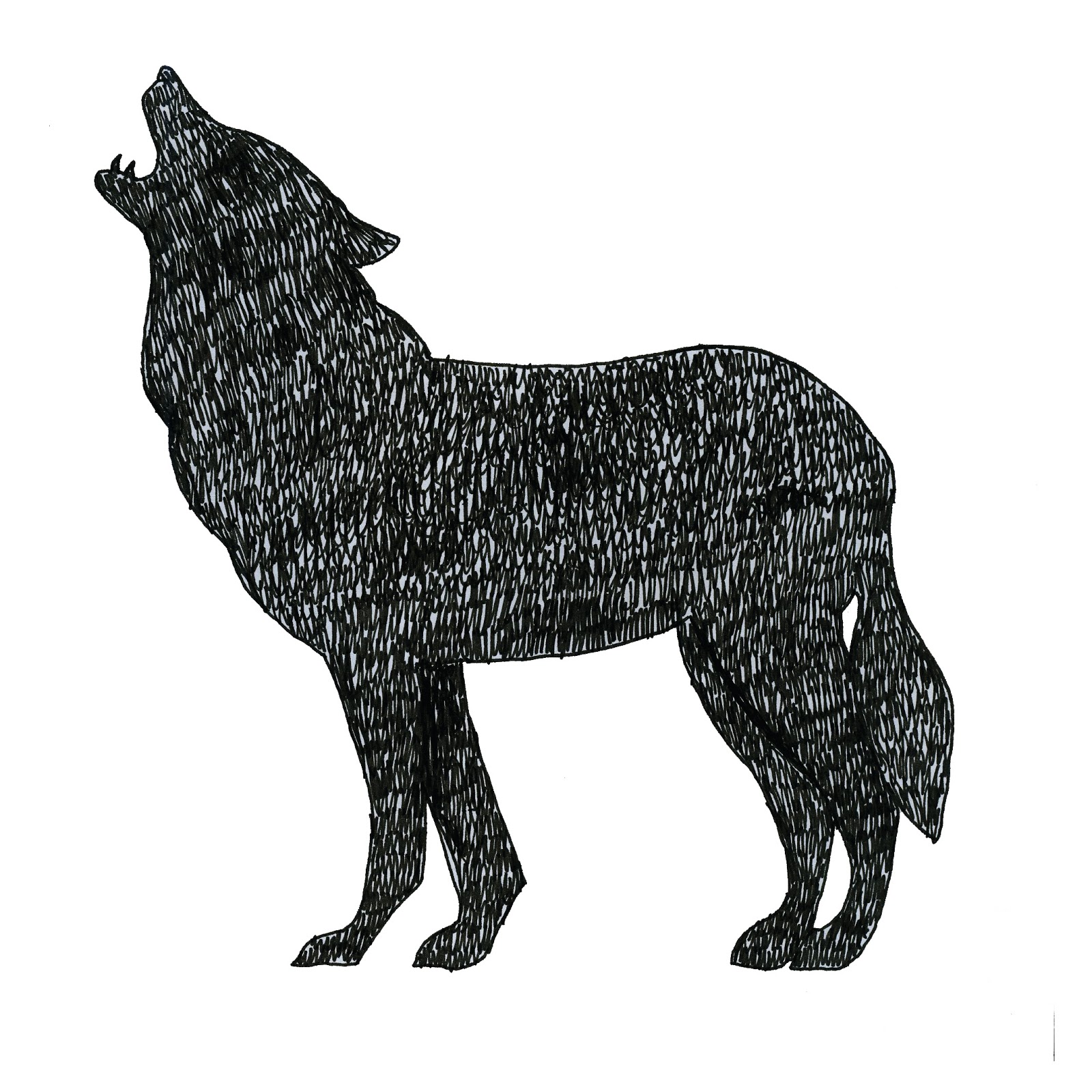
I started off by making sketches of woodland animals or 'beasts' that represent death and sadness.
Drawings:


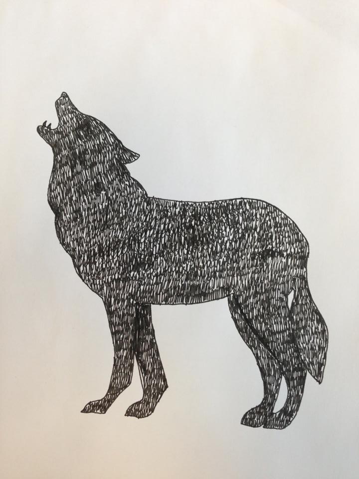
I used a fine liner to create the rough texture of the wolf. I am really pleased with this drawing. I think the rough grainy texture links with the unique sound of Laura Marling. I think it has the earthy, ethnic connotations I was going for. I hope to scan this in and use it as part of my final piece.


The crow represents death. Since I found the fineline texture of the wolf good I decided to use a similar technique in this. I also added some other line thickness' and patterns to add more visual interest and diversity.


For this drawing i chose the magpie. A lone magpie represents sorrow. I have added a number of patterns and also some areas of solid colour. so that they aren't too distracting.
Cut paper:
For some further experiments I looked in to cut paper.


Development of vinyl sleeve:


Here are some of the original ideas I had put in to the correct format. I decided that the simple black illustration against the white background was too simple, therefore I added some colour. I still thought that they were missing something. I think that the colour experiments detract from the message i am trying to express. Even thought the red colour of the crow connotes danger, love and passion i think it is too garish and bright and doesn't suit Laura Marling's musical style.
Forest photography:
I took a number of photos at a forest near my home town. The woods match the etherial, elfin like Laura Marling. Forests can also be daunting and scary places. here are a selection of the photos:


Two examples of the photographs layered over the wolf using blending tools and layers in photoshop. I am really happy with this design, I will use it in my final design.


These are the five designs I am taking to the crit. I am really pleased with them. I like the blend of photography and illustration. The woodland photography mimics the whimsical, whispering tones of Laura Marlings voice. It reminds me of whistling wind through trees.
FINAL DESIGN:

This is my final design, The people in my crit agreed that the coloured designs worked better than the monotone ones. I am really pleased with the final outcome. I think i have interpreted the brief in an unusual challenging style for my self. I really enjoyed the manual more hands on approach using illustrations and cut paper.


No comments:
Post a Comment