In order to answer the brief we decided to create an app with helpful facts and tips bout living a healthy life style. We chose to create an app for a number of reasons. Firstly it is more dynamic and interesting than a poster. Secondly you can relay more information back to the audience, so we could utilise the breadth of our research to greater effect and lastly It is appropriate for our target audience of young working adults and students who are always on the go, and constantly using their mobiles to keep in contact with one another. Because of this i came up with the idea that facts page could have a share button so people could share the facts on online networking sites in order for the information to make it out to a wider audience.
Colour scheme...
Typefaces...
We looked around different websites and blogs to try and find information and inspiration on how we wanted our design to look. We really liked the typeface above, and thought this could go well with our app.
Designing the logo:
Sam came up with the idea of a hand and a heart to represent health, and designed variations of this.
We all decided that the third hand was the best and so went with that and continued to develop it.
Once we had started designing the app pages with the information on, it became clear that we needed another colour in order for it to look complete whilst also keeping the icons clear and contrast from the background. So we added a deep purple as seen below.
How it looked on the app store.
We then started to develop our own ideas on illustrator, designing icons, layouts and possible logos for our app to get a better understanding of where we wanted to go with it, if the colour scheme worked for each topic within a healthier lifestyle and to get a better perspective of how our app could look.
We stuck with the colour scheme throughout as we felt it worked well and look eye catching and grabs attention. There were a lot of varying designs and idea's that came together after this stage in the project, which I feel was extremely helpful in terms of determining which designs and ides we liked the most.
These are the final icons we chose:
The typeface we used we found on losttype.com and is called, Lavanderia. We used it as it was flowing, mobile, agile and well weighted. All of these things fit with the idea of being healthy and happy. For the stock typeface we used was, Muncie also found on losttype.com, this was a readable and simple font that clearly conveyed what we needed to say.
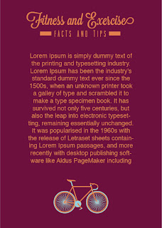
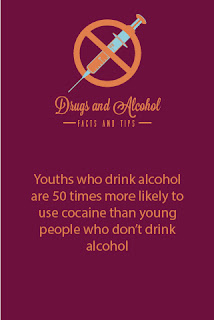
Designing the app pages: Again we stuck to the colour scheme and the typefaces used previously, and on each page we included a fact on that specific topic within healthy lifestyle to help promote this to anyone who downloaded the app.
We all decided the top one looked better as you could see more detail on the icon, and the layout was simply more aesthetic.
These were our final pages.
We had yet to come up with a name for our app and pretty much just spit balled in a group until we came up with something we liked. Eventually Abi thought of 'Healthful', we thought this was simple and a playful change of 'helpful' which fitted our app perfectly as our aim was to help people maintain and improve a healthy lifestyle. We also needed a small sub-title to help people understand more what the 'Healthful' App was all about. As our logo included a hand, we used, 'Take your health into your own hands'. It fitted in with the design and imagery as well as promoting our idea.
The main menu...
For the main menu of the app we wanted to include each logo to represent each page, so we took the hand used for the app icon and above each finger we placed our four logo's for Sleep, Diet, Drugs and Alcohol and Exercise. Again keeping everything consistent with all the other pages. On the app you would simply click on on of the logo and it would go to the page on that certain topic, you would then slide the screen back to go back to the main menu. We kept it very simple and easy to use.
Overall we were happy with what we created and designed. We though it portrayed what it needed to well, and was aesthetically well designed. However I think all of us felt like we had limited time to produce a good solid outcome. There were things we would have liked to design and add in if we had more time. We wanted to develop the icons into showing percentages and more figures about how they help and aid one'e health. We did start designing these but we didn't have time to add them into the app. But this is the kind of thing we were aiming at...


No comments:
Post a Comment