Showing posts with label 505 Studio brief 1. Show all posts

Sunday, 18 May 2014

OUGD505 Studio brief 1: Final Photographs

OUGD505
STUDIO BRIEF 01
FINAL PHOTOGRAPHS


Over all I am really happy with the end product, the only issue was on the quotes pages, I had tightened the press too hard in the binding stage. As a result the ink had transferred to the facing page. Due to time constraints I didn't have time to reprint and rebind the book. I think this compromises the end finish of the book slightly and had I utilised my time more efficiently I would have definitely reprinted the book. I also had trouble matching the colour of the book to the packaging. All in all I am pleased with the products and think they are well suited to the aesthetic and concept that i had in mind. 


Friday, 16 May 2014

OUGD505 Studio brief 2: Book mark design

OUGD505
STUDIO BRIEF 02
BOOK MARK DESIGN

I decided that book marks would also be a good product to create as memorabilia for the gift shop, this product is marketed at the tourists as well as the nostalgia group.


Monday, 12 May 2014

OUGD505 Research book: Packaging

OUGD505
STUDIO BRIEF 01
RESEARCH BOOK
PACKAGING

Originally i had struggled to come up with an idea for the packaging of my research book, as it seems contradictory to package a book about modernism, as it goes against the rules of modernism. So i decided to make packaging that looked like it wasn't there. 


I started off creating this net, it is in the style of a book jacket with a pocket to hold the book in place.

I used the front and back cover of the book as the front and back cover of the packaging to create a seamless look, asif the packaging is actually the book its self.

Next I added the front cover image to the inside pocket of the packaging, this is the part that will contain the book, I measured the image so that it will align with the cove of the book image inside.

Dimensions: 

Dimensions - A5 , Width - 148 mm , Breadth - 11mm , height - 208mm

Unfortunately after printing the packaging i realised that it wasn't big enough to fit the book in so i changed the dimensions.

Corrected dimensions - A5, Width - 150mm , Breadth - 12mm, Height - 210mm

The second print fitted the book in perfectly.


Sunday, 11 May 2014

OUGD505 Research book: Binding

OUGD505
RESEARCH BOOK
BINDING

I decided on an exposed perfect bind for my book, The bind suits the theme of the book, it shows the use of materials is very tactile and also sturdy. The bind was relatively simple to do, and luckily went right first time.


Firstly I put the pages in a press, sandwiched between 2 pieces of mount board for protection. 


I then applied a thin layer of pva glue over the seam and placed a strip of gauze over it. I left it to dry for 30 minutes.


After 30 minutes I then applied another layer of PVA glue to the gauze. This time i left the glue for an hour before covering it with a final layer.


Once the glue had completely solidified i removed it from the press and trimmed off the excess gauze using a sharp scalpel.


Thursday, 27 March 2014

OUGD505: Research book Re-design

OUGD505
STUDIO BRIEF 01
RESEARCH BOOK
RE-DESIGN


LAYOUT:


This layout will be used to present the information, it will have a large image to the left page accompanied by the relevant information and facts on the right page. I think this layout suits the book well, as it employs the conventions of modernism, by showing the information in a clear and functional way with out relying on the stylisation of trying to make the design look modernist.


To break up the informative pages I will also include some full bleed images and quotes from Frank Lloyd Wright, this will provide information on the beliefs and teachings of Frank Lloyd Wright.


GRIDS- ROWS & COLUMNS:

For the redesign of my research book i have decided to limit my self to 2 different layouts. I have decided to do this as it was stated in my crit feedback that there wasn't enough cohesiveness. I decided to employ 2 different structures to help break up the layouts and make it visual pleasing as well as having an over all organised and unified book.


I started the process by introducing a grid system to the DPS, The grid provides 4 columns and 4 rows, This will help me to create unified layouts.

TYPE CHOICE:


I chose the san serif font apercu in 2 different weights for my publication. Bold for headings and titles and regular for body copy. I chose this font as it is very readable at a small scale. It is also very functional and eye catching at a larger scale in bold too.

CONTENT AND STRUCTURE:

P1-2
Biography

P3-4
Johnson Wax Tower

P5-6
Quote

P7-8
Falling Water

P9-10
Quote

P11-12
The Guggenheim

Before designing I decided on a set structure of the content, this allowed me to plan all the relevant information to the book and what order it will go in.


IMAGES:


To adjust the images I opened them in photoshop and edited them black and white, this was for aesthetic purposes as some of the images i selected were already black and white. I also adjusted the levels to give them the right mix of light and shadow.


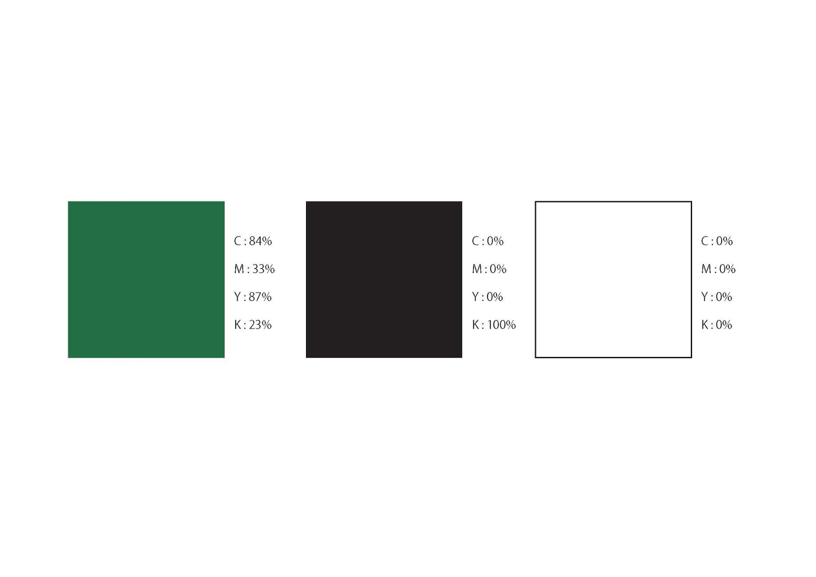
COLOUR SCHEME:


INFORMATION: 

INTRODUCTION

Frank Lloyd Wright is widely considered as one of the greatest american architects of all time. He introduced the concept of “Organic architecture” and designed such landmarks as the Fallingwater and the Guggenheim Museum of Art. After a turbulent personal life his work is all that remains, with an extensive number of his architecture still standing and many more plans that were never realised his ideologies and believes live on through his work. This book takes a look in to some of his most famous works, including some of his most famous quotes ad teachings.

FRANK LLOYD WRIGHT

Frank Lloyd Wright (born Frank Lincoln Wright, June 8, 1867 – April 9, 1959) was an American architect, interior designer, writer and educator, who designed more than 1000 structures and completed 532 works. Wright believed in designing structures which were in harmony with humanity and its environment, a philosophy he called organic architecture. This philosophy was best exemplified by his design for Fallingwater (1935), which has been called “the best all-time work of American architecture”. Wright was a leader of the Prairie School movement of architecture and developed the concept of the Usonian home, his unique vision for urban planning in the United States. His work includes original and innovative examples of many different building types, including offices, churches, schools, skyscrapers, hotels, and museums. Wright also designed many of the interior elements of his buildings, such as the furniture and stained glass. Wright authored 20 books and many articles and was a popular lecturer in the United States and in Europe. His colorful personal life often made headlines, most notably for the 1914 fire and murders at his Taliesin studio. Already well known during his lifetime, Wright was recognized in 1991 by the American Institute of Architects as “the greatest American architect of all time.

JOHNSON WAX TOWER

Racine, Wisconsin US
1944-1950

The Johnson Wax Headquarters were set in an industrial zone and Wright decided to create a sealed environment lit from above, The building features Wright’s interpretation of the streamlined Art Moderne style popular in the 1930s. In a break with Wright’s earlier Prairie School structures, the building features many curvilinear forms and subsequently required over 200 different curved “Cherokee red” bricks to create the sweeping curves of the interior and exterior. The mortar between the bricks is raked in traditional Wright-style to accentuate the horizontality of the building. The warm, reddish hue of the bricks was used in the polished concrete floor slab as well; the white stone trim and white dendriform columns create a subtle yet striking contrast. All of the furniture, manufactured by Steelcase, was designed for the building by Wright and it mirrored many of the building’s unique design features.


QUOTE:


LESS IS MORE, ONLY WHEN MORE IS NO GOOD


FALLING WATER

Bear Run, Pennsylvania, US
1935-1939

Of all Wright’s constructions, Fallingwater House is the most famous. An elevated building situated on a water fall, the home sits betwee the Pennsylvania hills and is adapted perfectly to fit the form of the rocks. With this house, Wright sought to join the elements of nature- forest, river, and rocks- with the construction materials as much as possible. The goal was to create a bulding in harmony with setting and provide a space for rest and relaxation. Once Wright had decided the location of the house, he had the obvious problem of building it there. The location of the north bank of Bear Run was not large enough to provide a foundation for a typically built Wright house.

QUOTE: 

I BELIEVE IN GOD, ONLY I CALL IT NATURE.

THE GUGGENHEIM MUSUEM

New York City, New York, US
1955-1959

The Guggenheim museum’s proximity to Central Park was key; as close to nature as one gets in New York, the park afforded relief from the noise and congestion of the city. Nature not only provided the museum with a respite from New York’s distractions but also leant it inspiration. The Guggenheim Museum is an embodiment of Wright’s attempts to render the inherent plasticity of organic forms in architecture. His inverted ziggurat (a stepped or winding pyramidal temple of Babylonian origin) dispensed with the conventional approach to museum design, which led visitors through a series of interconnected rooms and forced them to retrace their steps when exiting. Instead, Wright whisked people to the top of the building via elevator, and led them downward at a leisurely pace on the gentle slope of a continuous ramp. The galleries were divided like the membranes in citrus fruit, with self-contained yet interdependent sections. The open rotunda afforded viewers the unique possibility of seeing several bays of work on different levels simultaneously. The spiral design recalled a nautilus shell, with continuous spaces flowing freely one into another.


SPREADS:


Due to the ambiguous title i decided to have a portrait of Frank Lloyd wright on the cover in order to make it clear who the book was about.


DESIGN DECISIONS:


The concept behind the lines fragmenting the text is to show Frank Lloyd wright's method of design. He believed in organic and often fragmented design, to break up the architecture and allow it to fit in to it;s surroundings. Lines and structure also played a key part in Frank Lloyd Wright's architecture, I mimicked this in the book.


DIGITAL BOOK PRESENTATION:


Tuesday, 25 March 2014

OUGD505: Research book Initial design and crit feedback

OUGD505
STUDIO BRIEF 01
RESEARCH BOOK INITIAL DESIGN
CRIT FEEDBACK

This was the book that I presented in the crit. Going in to the crit I wasn't happy with the design, I failed to utilise the layout designs that I had created prior to designing the book. This was also an unfinished design as I had rushed to get it completed in time for the crit, as a result i wasn't expecting a lot of positive feedback. Personally I feel i have focussed on trying to emulate a style rather than design it with my own style in character in mind, Because of this I plan to redesign the book, but it will be interesting to see if there are any features of this book that I could use in the redesign.


Feedback:Red shapes over the images are distracting, try and show the images off better by showing them full bleed with out the red shapes overlaid. 

My comments: This is really useful feed back, like I said previously i think i focussed to much on creating a style for the book, and as a result have compromised on the purpose of the book. Frank lloyd wright was a modernist architect and a forward thinker of his time, This means that 2 things should be apparent in the design of the book; Firstly it should show off his architecture, secondly form follows function, which means the design of the book should be effortless and not trying too hard to look like something else.


Feedback: Page Layouts are a little too unconventional and don't flow together.

My comment: I agree with this feedback, this is due to the lack of grids and layouts being applied. I need to utilise grids and layouts in order to create a cohesive and structured page layout that is interesting as well as informative.


Feed back: The use of 2 colours is eye catching and striking.

My comment: The colour choice is one of the things that I am pleased with the book. I like the subtle yet bold choice of colours and think it draws the reader in well.

Feedback: Keep consistency of the captions, needs captions of page full of images, what am i looking at?


Tuesday, 4 March 2014

OUGD505 Build a brand: Group task presentation

OUGD505
BUILD A BRAND
GROUP TASK 
PRESENTATION


OUGD505 Build a brand: Group task

OUGD505
BUILD A BRAND
GROUP TASK

Today we were put into groups of three to work in. I worked with Lizzy and Laura. We were given a word to work with, our word was 'fencer'. With this word we had to create our own brand. The word can be perceived in two different ways, it can relate to the fencing sport as well as someone who builds fences. 

All of the thought processes below are fairly self explanatory. During the time we were talking about what we were going to create and what route to go down, Lorraine came over and had a chat with us. She knew quite a lot about fences and everything we may need to consider. At this stage we had decided that we were going to focus on building fences as opposed to the sport. When Lorraine spoke to us though, it made us think differently as we don't have the time to research into it in too much depth in one day. 

This made us think differently about the brief and consider our options on a wider scale. We didn't want to just brand a company who simply builds fences, but instead wanted to create something unique and memorable, giving people a reason to choose us rather than every other fencing company out there that already exists.


We had a little think about possible straplines we could include. This was quite challenging and we came up with quite a few in conversation that were quite cheesy and not really suitable. We decided that we should think of a name for our brand before doing this. 


We discussed our potential brand ethics and talked about whether we should be a high end brand or whether we should be a family run business. This will determine our branding quite considerably. 


We then had an idea to create a brand which encompasses the idea of creating pieces for the garden which include fencing parts. We thought about how we could advertise ourselves and what products we would sell to our target audience. We decided that we should provide a range of products for our audience to choose from, depending on their situation and location.

We would be targeting people that live in the city who don't have much of a garden space. They would only have a small balcony space and so all of the products would have to be a suitable size, so that they don't take up too much room. 


When we were trying to think about possible names for our brand, we considered a wide range of possibilities. We considered gardening terms and came up with the idea of 'cultivate' which means to improve and prepare land. We all felt happy with this idea and so we decided to use it for our branding. 


We then spent an hour to produce some logo ideas individually. 


Below are all of the developed logo ideas. Although we all quite liked the idea of incorporating a plant/fence into the design, it just wasn't practical and looked a bit too fussy. We wanted to produce a logo which is quite contemporary and clean. 


I then collected some imagery. One to give us all inspiration and two to involve in our end presentation.


Below is all of our development and mock ups to include in our presentation explaining our brand. I designed the layout of the website along with laura. The gridded structure is to emulate the building of the wall. With the logo placed vertically to show the construction of the living fences.